FEATURE REQUEST: Minor Change to Edit Design Data Column Header Format
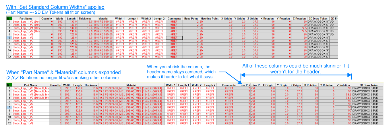
When "Set Standard Column Widths" is applied, the "Part Name" through the "2D Elv Token" (& Par) columns all fit visibly on my screen. However, the "Base Point", "Machine Point", "& "X,Y,Z Rotation" columns take up a lot of unnecessary real estate on screen, due to the header names being much longer than the data in the cells below. When the user then expands other columns (for us, this is typically to fit full "Part Name"s or "Material" strings), other fields end up not fitting on the screen due to this lost space.

Could these column headers either be:
-abbreviated ("Rot" for "Rotation", "Pt" for "Point", or similar)
-left aligned (so that if you shrink them, you still see "Base", "Mach", "X Rot", "Y Rot", etc.)
-formatted like "wrapped" text so that "Point" would fall under "Base")
-----last one is not my favorite, due to that taking up an extra "row" horizontally on screen
Any of these would allow those columns as a group to only take up about 1/2 of the space they currently do, allowing for users to expand other columns and still see more of the main columns on the screen without scrolling. This is a relatively minor UI thing, but it is something that has bothered me for a while, anytime I have to scroll or "Set Standard Column Widths" to see all my data.
Topic Participants
Sara Johnson
Toolbox BSB Survey
Have you been using Toolbox BSB? We'd love to hear what you think!
MVU eLearning
Grow Your Knowledge
Follow along with RJ as he takes you on a journey to build your foundational knowledge of Toolbox.
Follow us on: